Hello, I'm Jenny Huang
Blending design thinking with my background in information technology, I use my creative and analytical thinking skills to creative visual designs and solutions. I believe in human-centered design, that balances empathy and purpose. To do so, I stay adaptable, and curious to learn.

LiftOff

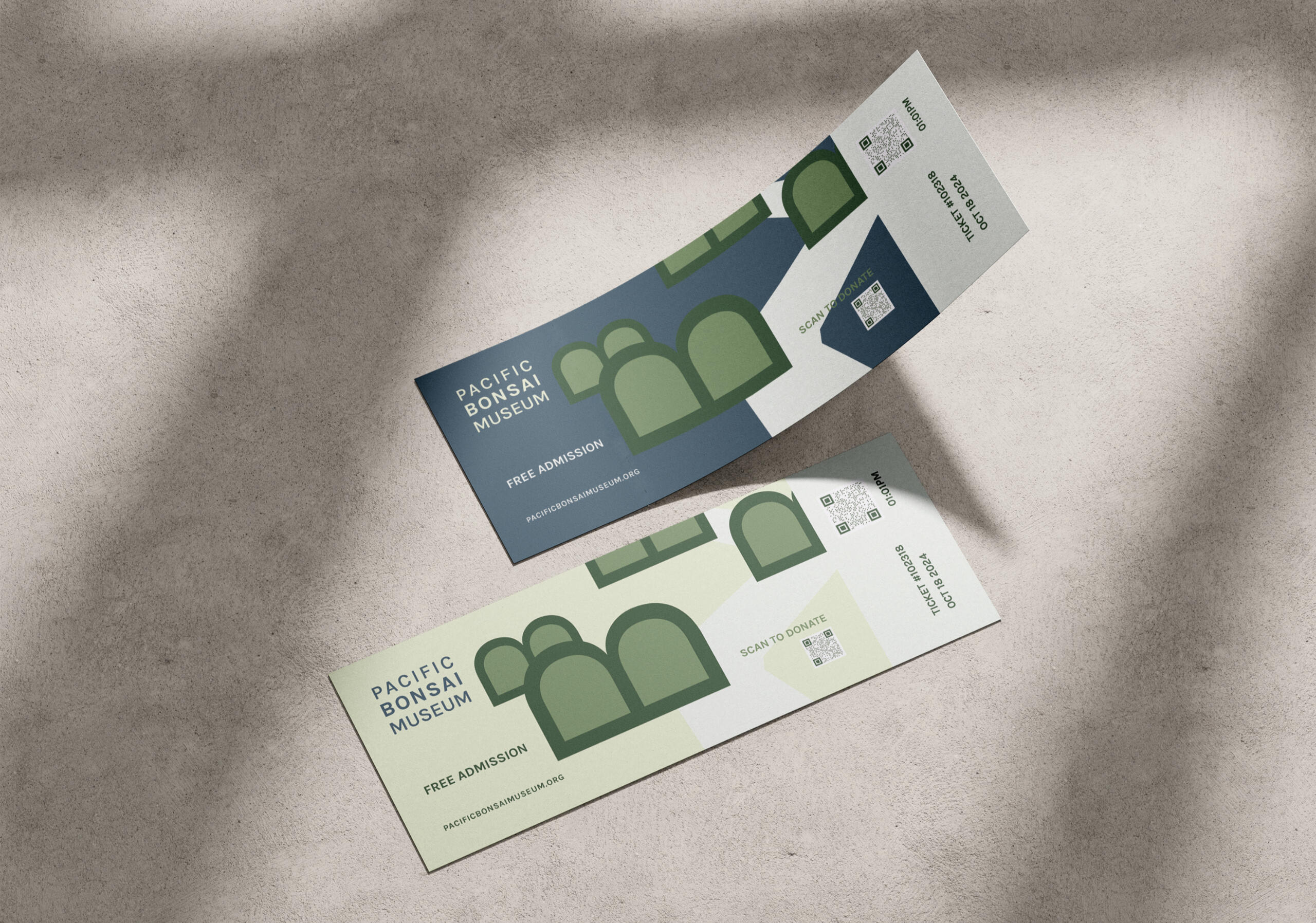
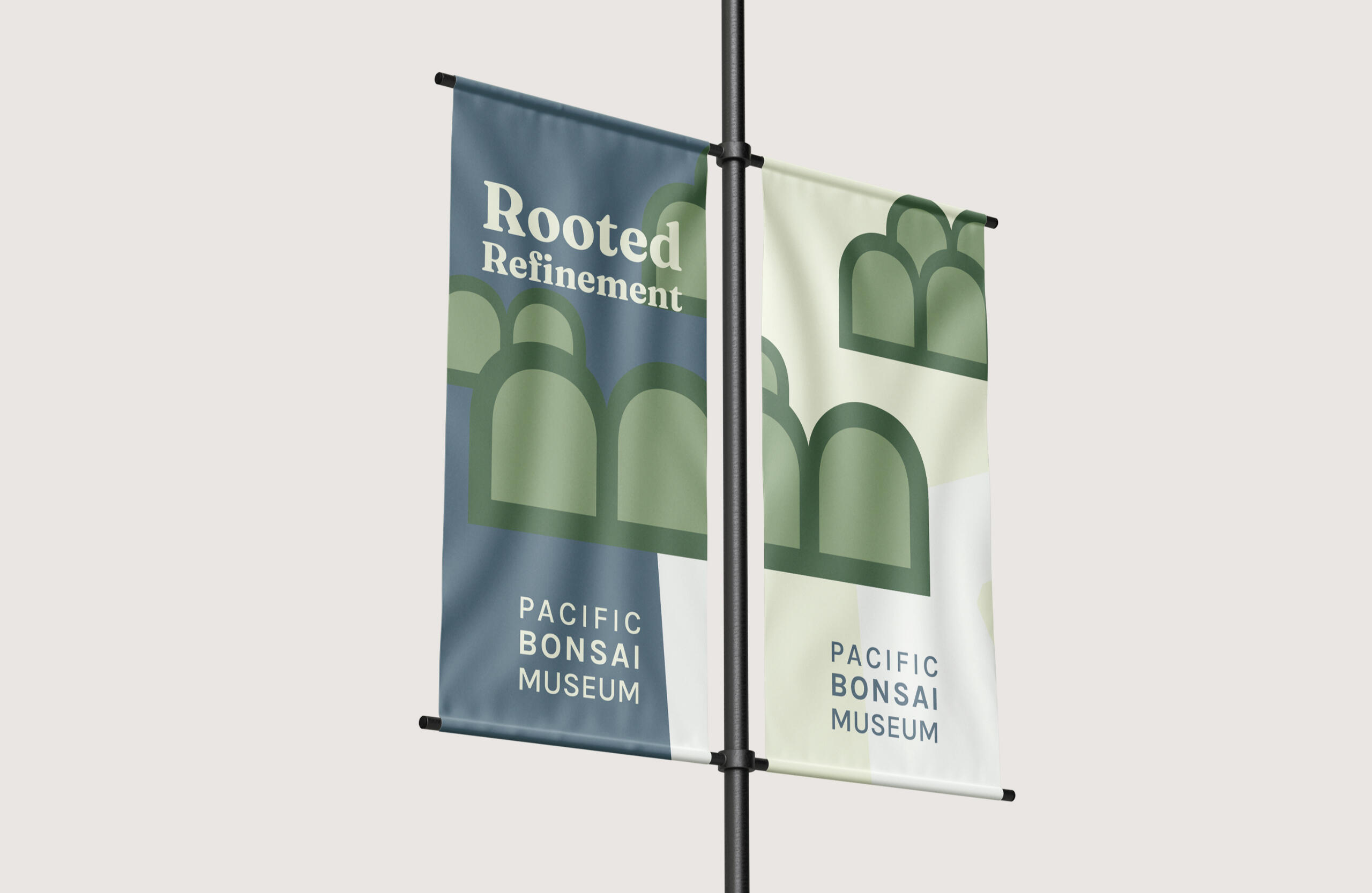
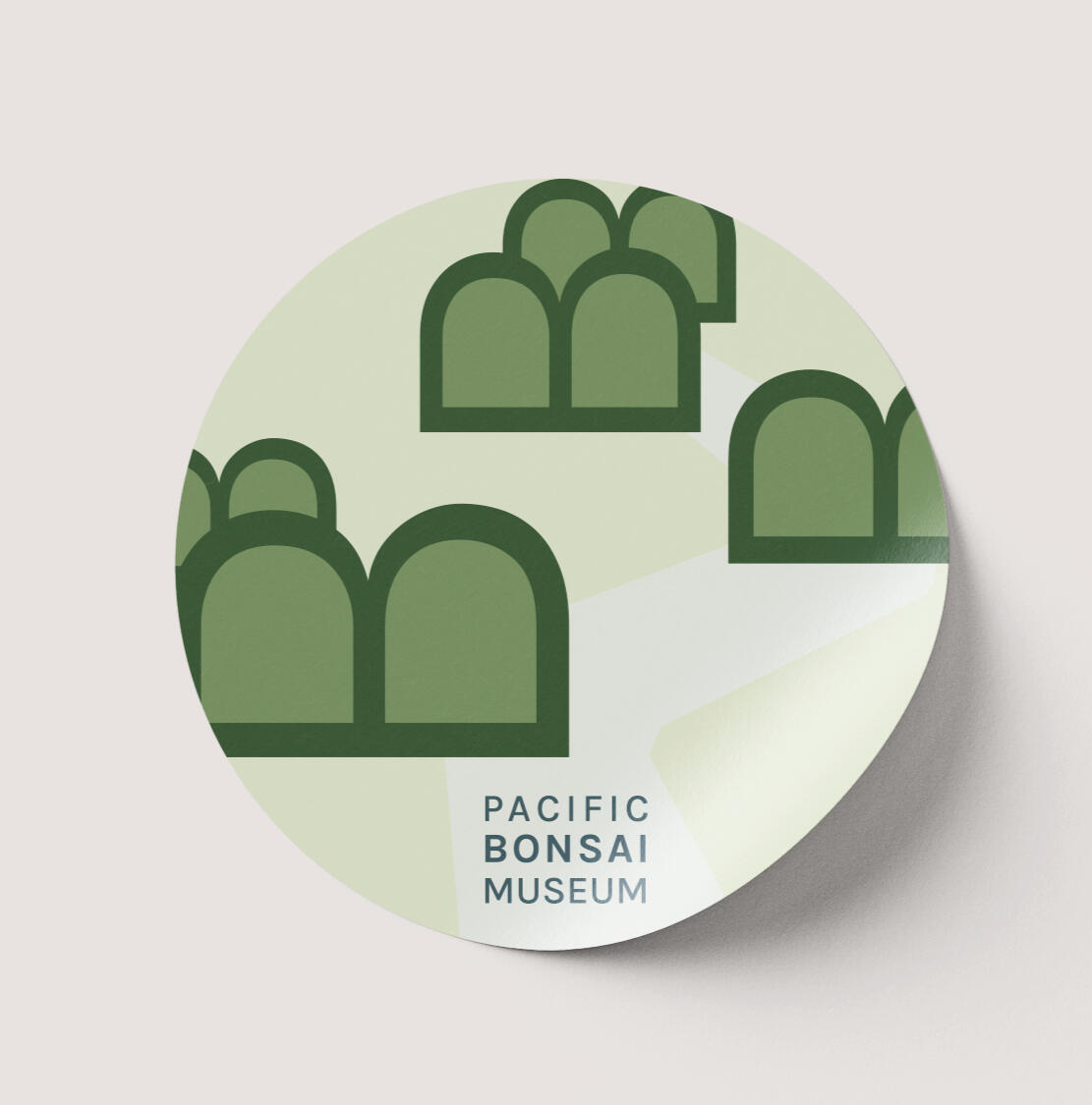
Pacific Bonsai Museum

Wander

Not A Pet
History Walk
Firefly Lane & Fly Away

Nice to meet you!
I'm Jenny Huang and I'm a graphic designer based in northern New Jersey. I have a background in information technology and learned graphic design through Rhode Island School of Design's Continuing Education Graphic Design Certificate Program. I decided to transition career fields since I have always been interested in design, and felt that it was time to make the change. I am a self-motivated individual who always strives to learn.Aside from design, I am a plant mom and a foodie. I love traveling and trying new food! As of recent, I am trying to maintain a good fitness routine. I may not play many games, but I love Pokémon and Overcooked. A fun fact is that I love lemon flavored sweets!
Brand Identity, Packaging Design, 3D Modeling
LiftOff
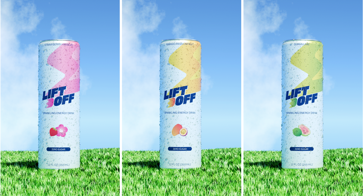
This is my capstone project, where I decided to create a brand identity from scratch for an energy drink. I chose energy drink as the subject since I consume them from time to time and found myself looking at the different label packaging on the cans. The concept for this is a boost of energy, and uplifting pick-me-up.


LiftOff
Process


I started with a SWOT analysis on the market to gain some insight of the market. To summarize, there is a growing market for energy drinks and going sugar-free may attract consumers who are conscious of sugar consumption and/or calories. I searched up energy drinks on the web and visited my local grocery store, and found that most of these can labels were bold and bright.I brainstormed a list of words relating to energy for a possible name and concept. The ones that stood out were for me were: energizing, bright, positive, boost, and uplift. Through further brainstorming, the name LiftOff came about to express the sense of uplifting, boosting energy, and the drink being a pick-me-up.
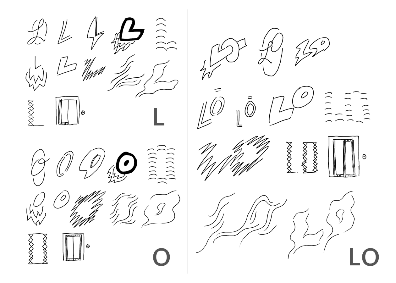
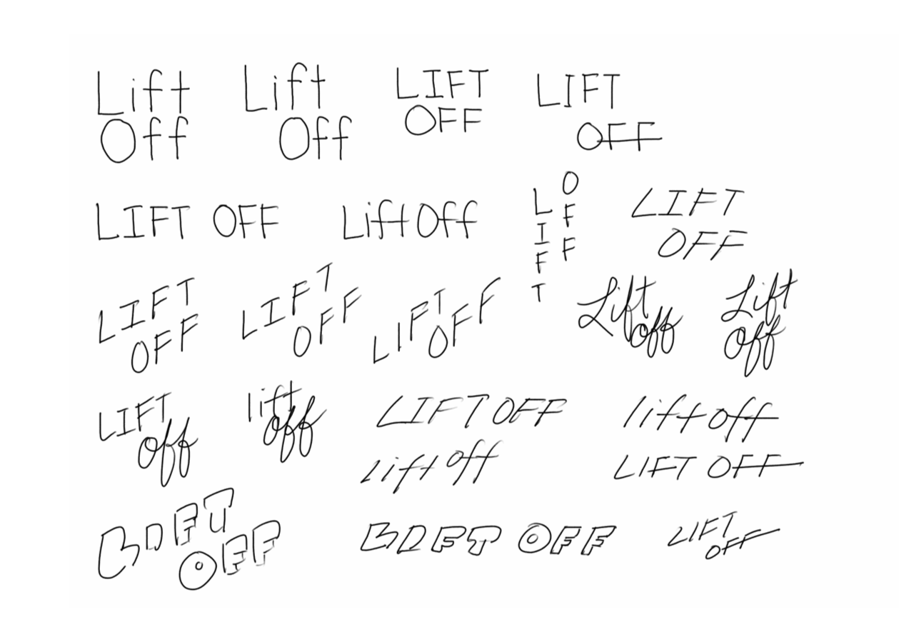


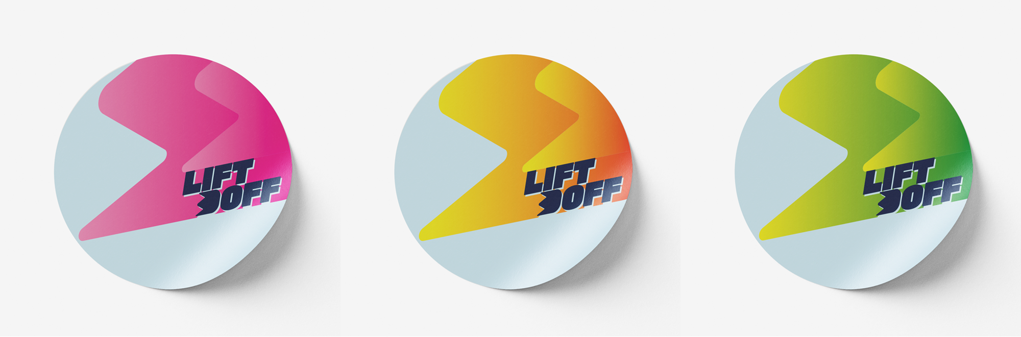
When I sketched the ideas using the individual first initials or the combination of liftoff, it did not fit the image I was going for and felt the use of the full word was best in this case. The primary typeface chosen is very bold and slanted to deliver the image of it taking off like a rocket or having a boost of energy. The secondary typeface is clean and legible, complementing the primary one. Through peer review and revision, below is the logo for the drink. The blue represents the image of the sky when lifting off.With the idea of have having bright bold flavors, I created secondary colored gradient schemes in accordance with the flavors: mango passionfruit, strawberry hibiscus, and guava lime. In blender I created the can and box mockups.
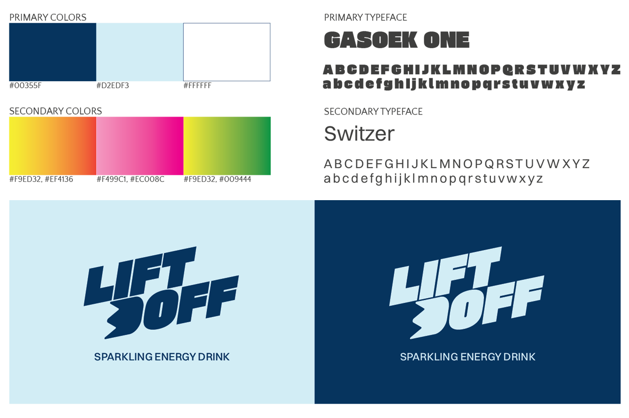
When I sketched the ideas using the individual first initials or the combination of liftoff, it did not fit the image I was going for and felt the use of the full word was best in this case. The primary typeface chosen is very bold and slanted to deliver the image of it taking off like a rocket or having a boost of energy. The secondary typeface is clean and legible, complementing the primary one. Through peer review and revision, below is the logo for the drink. The blue represents the image of the sky when lifting off.
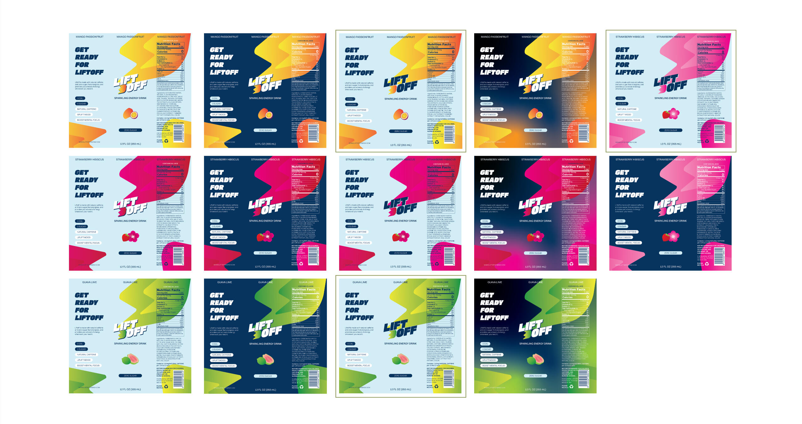
When designing the can label, it was difficult to decide on the final design. The labels looked quite bold on a dark navy background, however the light blue background works well with the image of it representing the sky. It was through peer review and seeing the designs on the 3D mockups that I came to decide that the light blue background works better. I’d like the material of the can to be a semi-metallic finish.Next, the problem I encountered was the legibility of the navy text on magenta accents. I wanted to make adjustments to improve legibility while maintaining cohesion with the rest of the designs. To enhance legibility, I found a a different shade of pink that is still reminiscent of a hibiscus flower rather than a cherry blossom that is also pink.
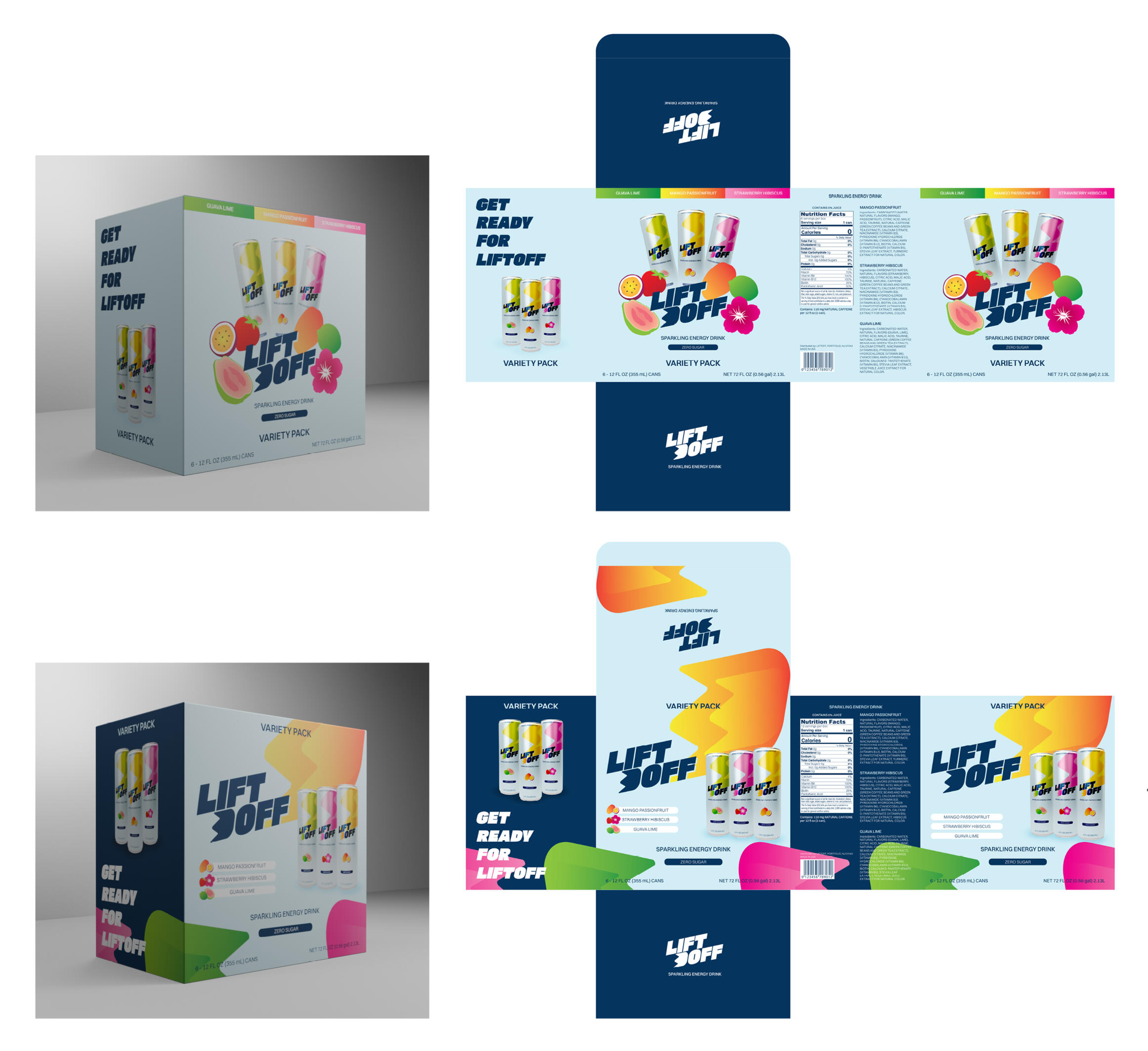
When designing the box for the variety pack of six with 3 flavors, I studied some of the beverage boxes I had on hand and the ones online. Imagining that these would be shipped to people, I designed the box to look sturdy. There were two designs that were good and yet again, it was a difficult decision. However, after applying it on the 3D mockup, one design stood out more than the other and I proceeded with that one.
Brand Identity
Pacific Bonsai Museum
This project is a rebranding of a museum. I took interest in the Pacific Bonsai Museum located in Washington state that operates as a non-profit organization. Their objective is to inspire a closer look at nature through the living art of bonsai.Upon a deeper dive on bonsai, I took inspiration from the different styles of bonsai and the different techniques used to create these styles. Bonsai truly is the mix of nature and art.Rooted refinement is the more "refined" wording to the concept that came up through research. I wanted to highlight the different forms and silhouettes that take form through the process of refinement. Hence the exhibit concept of rooted in nature, and refined by hand.
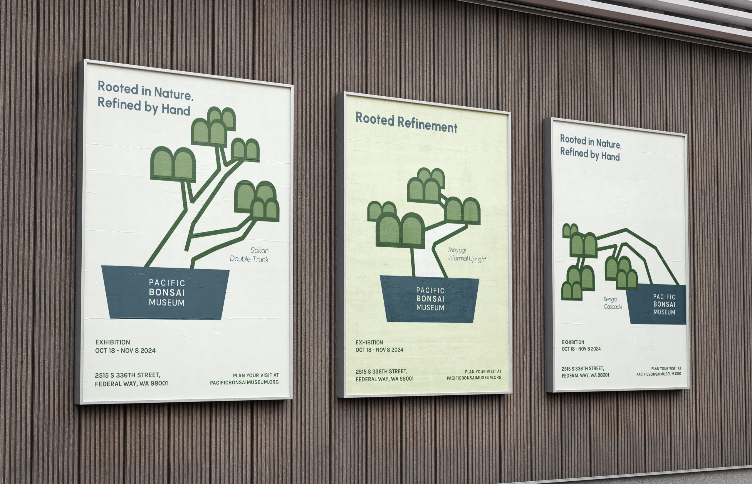
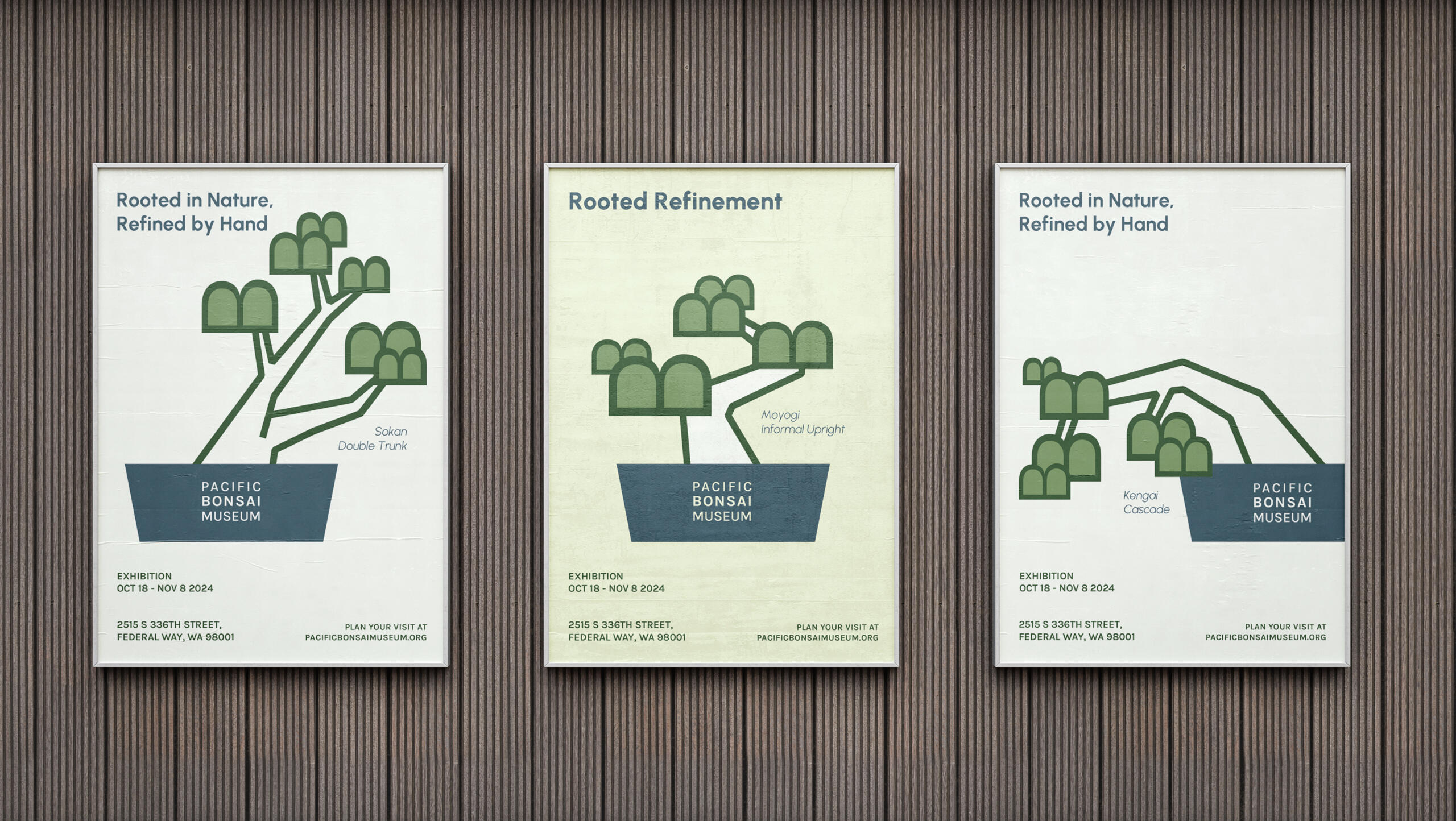
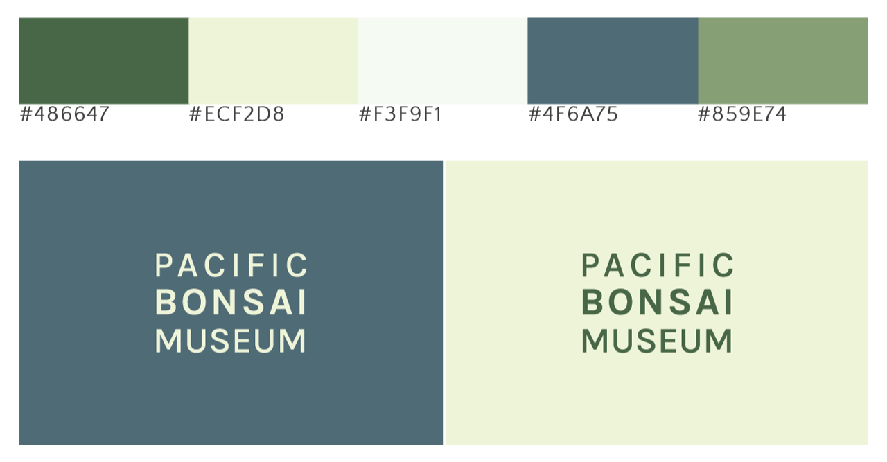
I took inspiration from the sense of zen and balance from bonsais and how they are living art. The green tones are from the color of the leaves and patches of green on some bonsai plants. The blue is inspired by the open sky of the museum and stones that may be a part of some bonsai plants. The primary logo is stacked justified because I felt that it appeared most balanced and zen that way. The word "bonsai" is bolded to add emphasis on the focus of the museum.


Editorial Layout
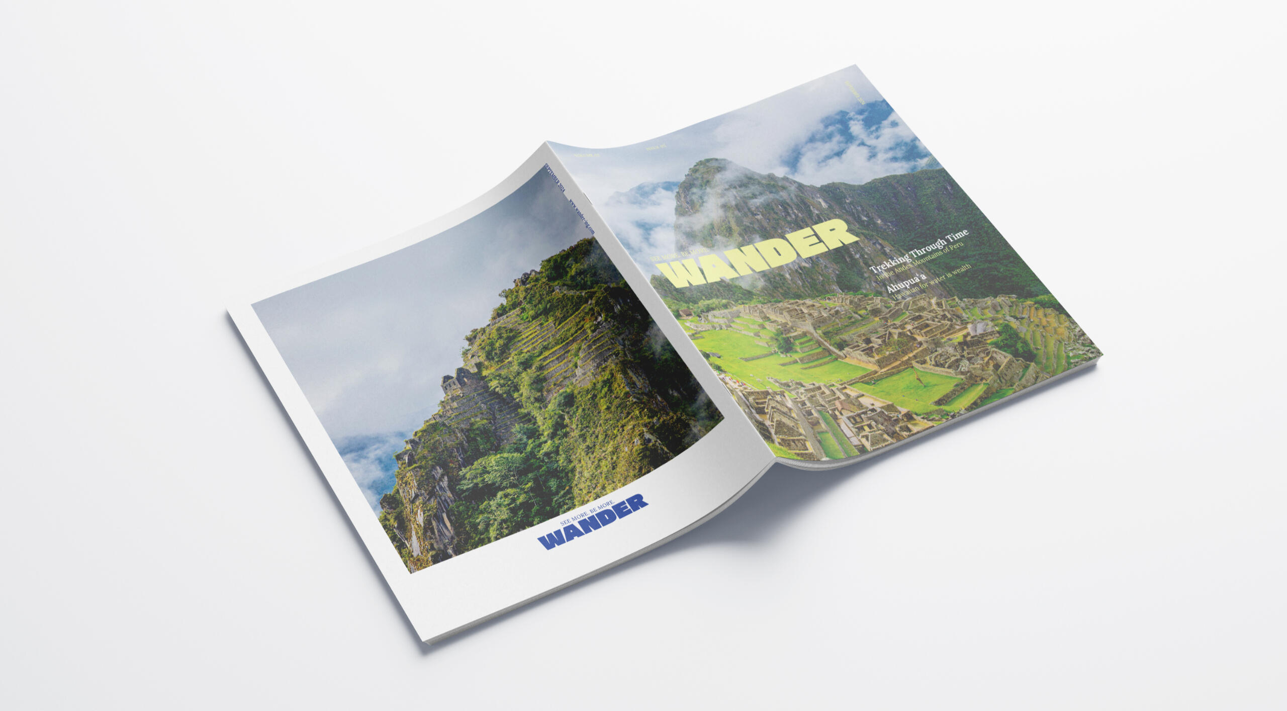
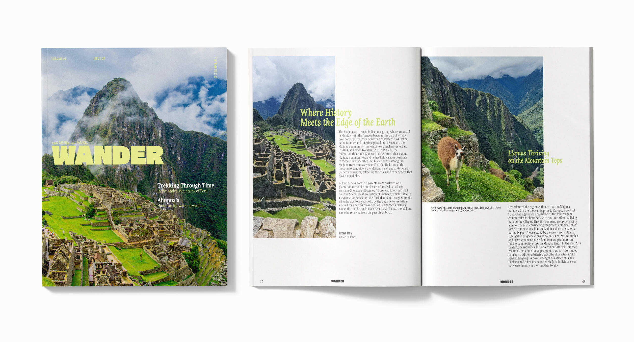
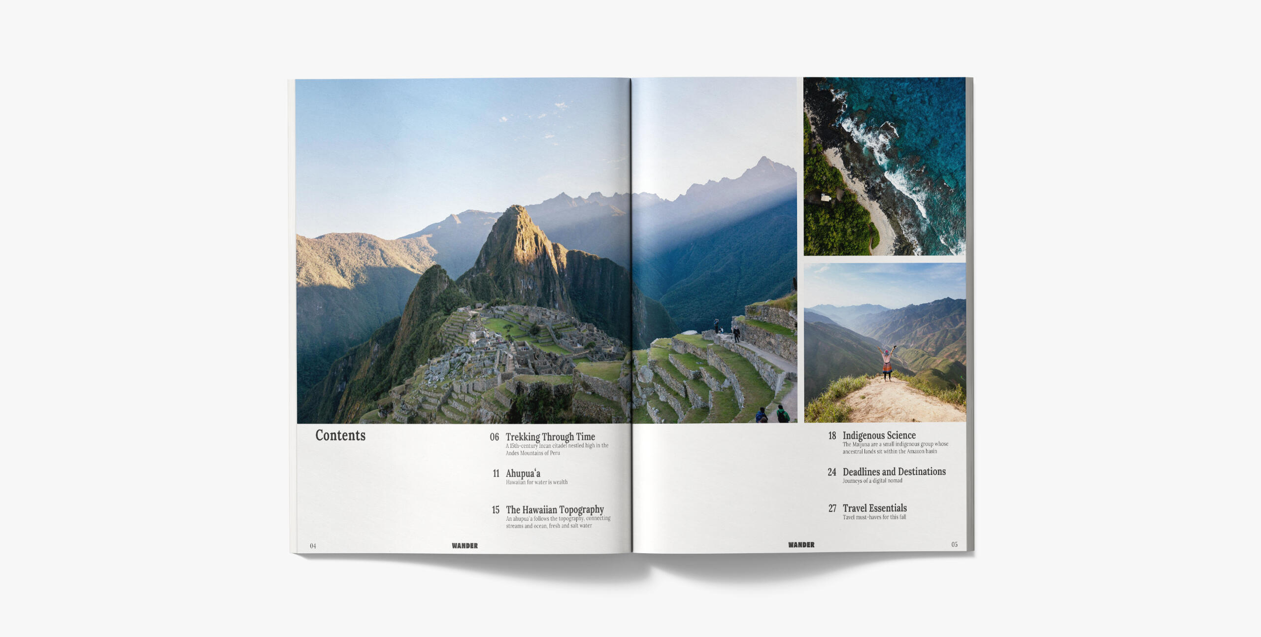
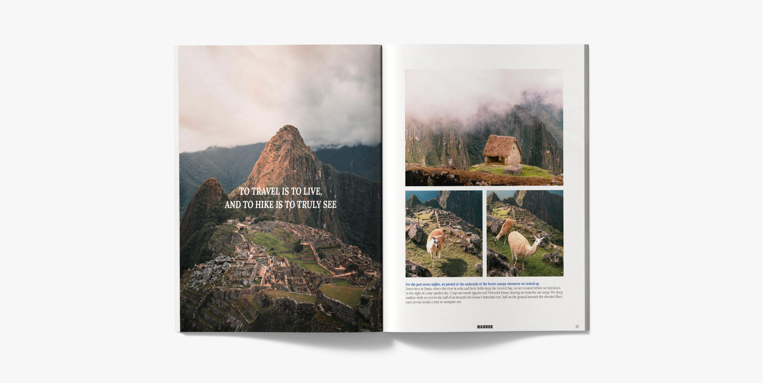
Wander Magazine
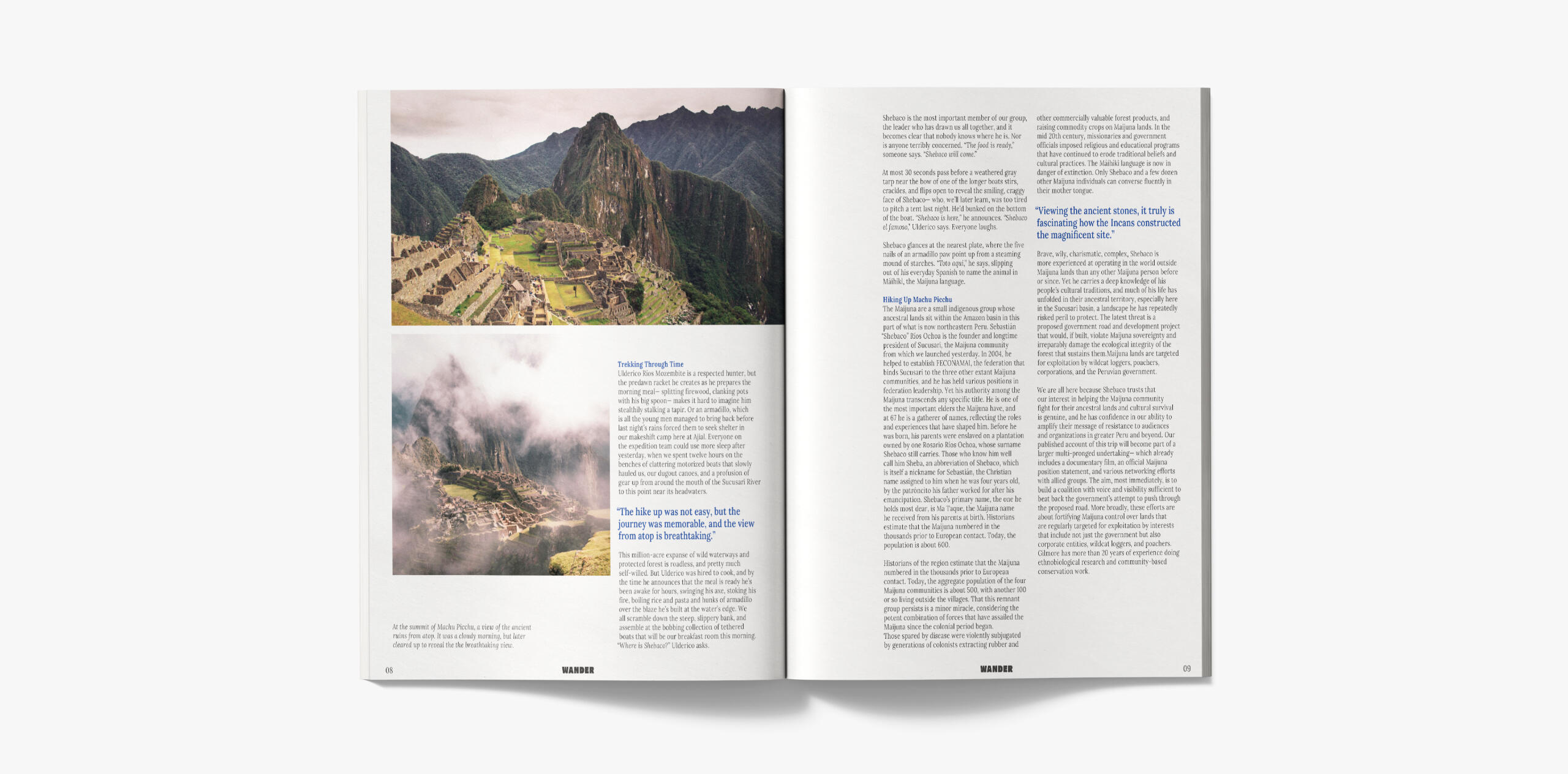
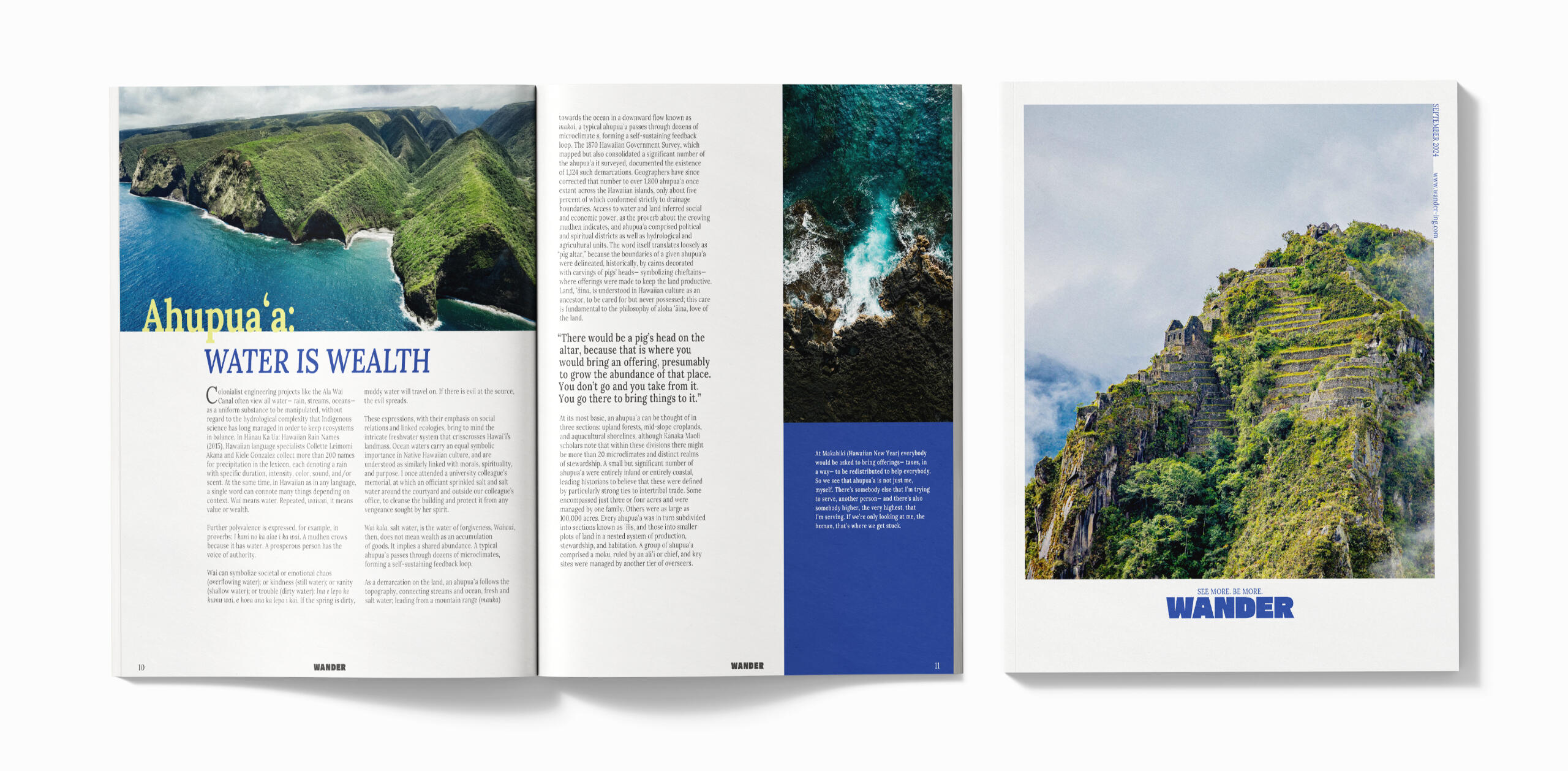
This assignment is present elements of an editorial, layout and the use of grids. For this project I made up a travel magazine that features different travel places and most of the text content is from Places Journal. I chose an overall bold and bright color palette to match the energy of exploration.
Public Service Announcement (PSA)
Not A Pet Campaign
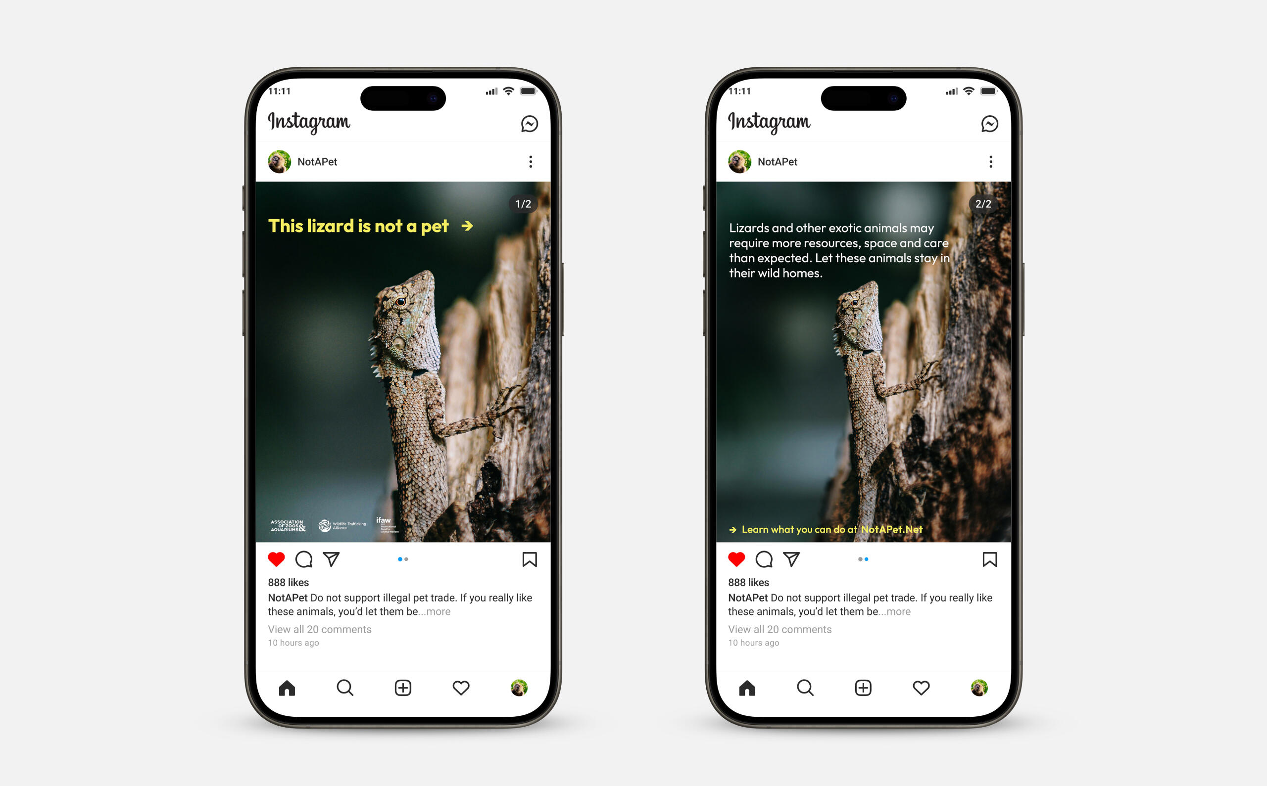
This assignment is a public service announcement on a social issue. I took interest on the #NotAPet campaign by Association of Zoos & Aquariums since there is an increase of exotic pet trade and many of which are illegal. The campaign addresses and hopes to educate people on illegal, unsustainable, and risks of exotic pet trade.

Environmental Design, 3D Modeling
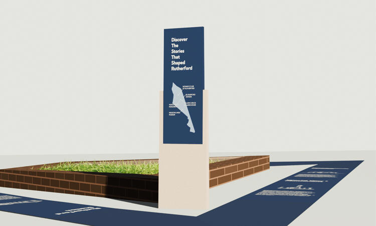
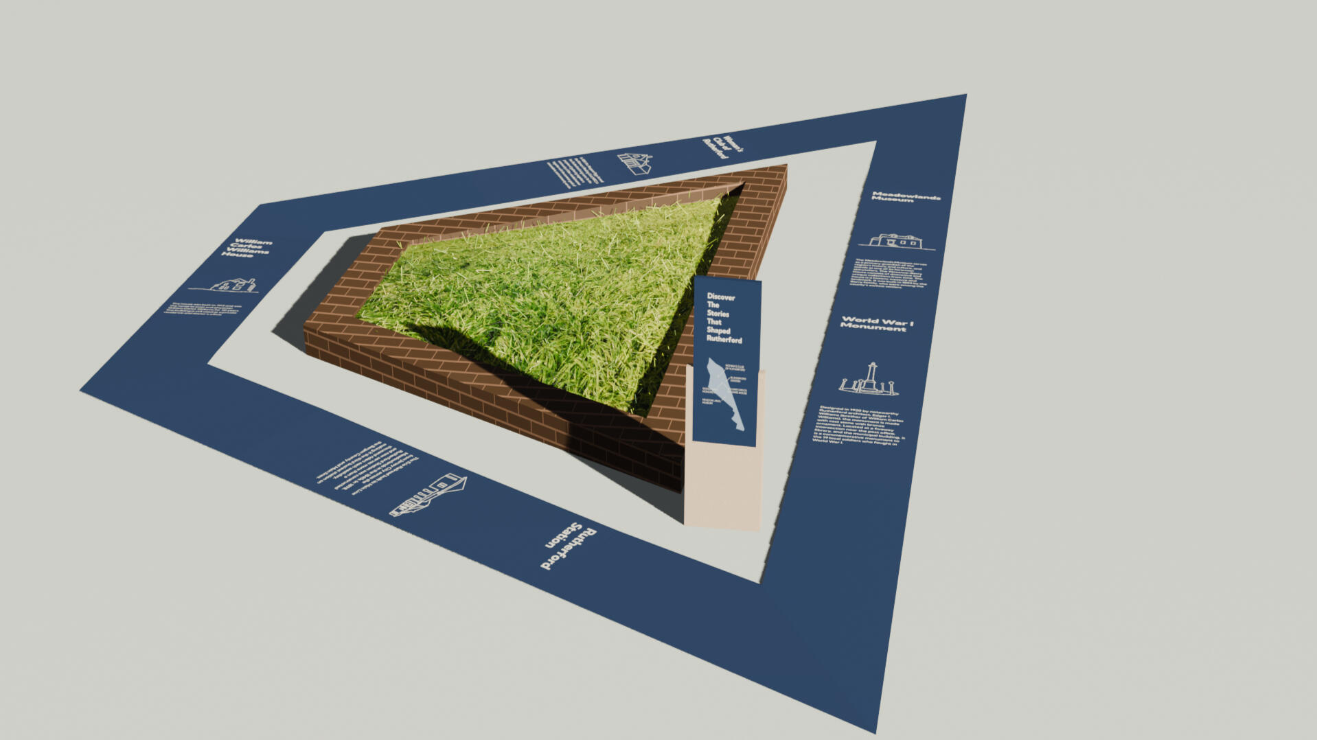
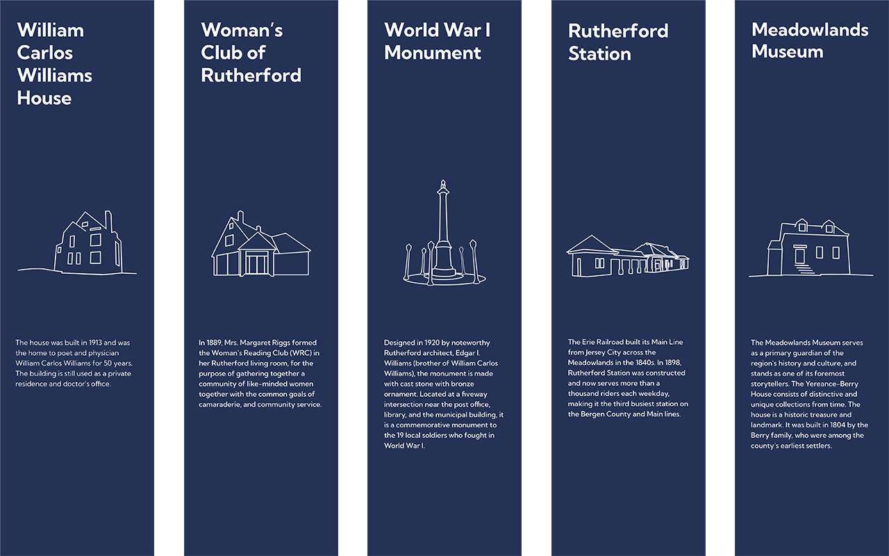
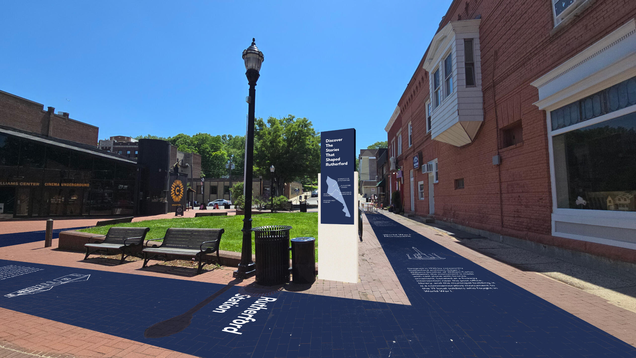
History Walk of Rutherford
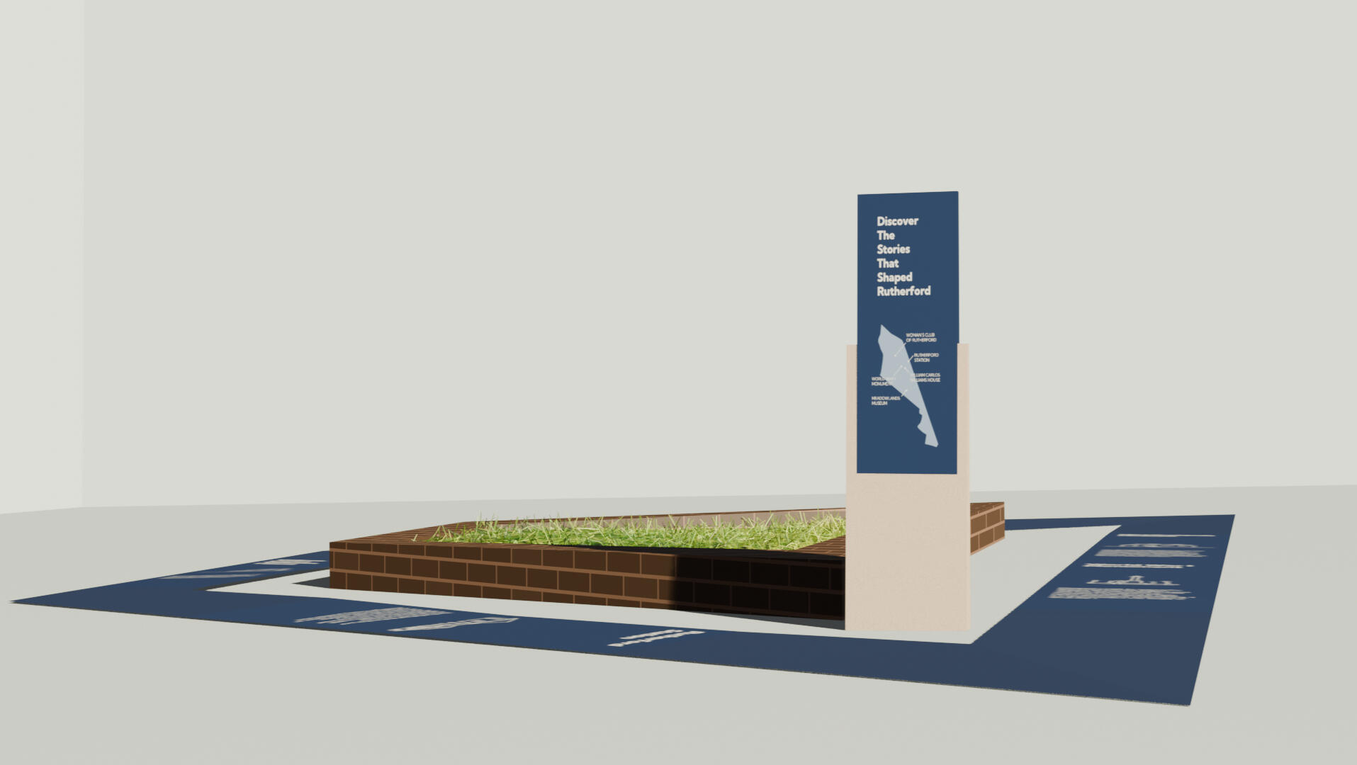
This assignment is a construction and designing for place from a chosen place. The space I chose was this shared space that is practically in the center of the little town area of Rutherford that has quite some foot traffic on the weekends.Through research, I was inspired by the town's rich history and decided to create a small history walk to highlight Rutherford's historic landmarks to share the knowledge and encourage people, whether the local community or passersby to explore these places. The color scheme of was inspired by the town's colors. Below are 3D renditions of the history walk I made in Blender and mockups of it on the photos of the space.

Book Cover Design, Illustration
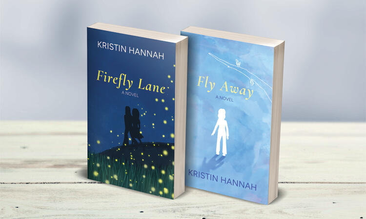
Firefly Lane & Fly Away
This assignment is for book cover design and this is my take on the duology of Firefly Lane and Fly Away. Firefly Lane is about coming of age and female friendship as they grow from teens to middle aged women. Fly away is more somber as it is deals with grief and healing. My take on this duology is a summer night vibe for Firefly Lane in contrast to the wintry vibe with the hope of spring for Fly Away.


